
Clarity in League
Hitboxes, color palettes, silhouettes, cats, skins, and more.
Hi everyone, today we want to talk about game clarity in League. It’s one of those things we’re always thinking about behind the scenes, but it only really becomes noticeable when we get something wrong—like when a hitbox doesn’t match an effect or a skin is too hard to read. In a perfect world, this never happens. But with over 150 champs and 1000 skins—not to mention items, runes, and neutral objectives—we’re bound to make mistakes sometimes.
That said, we think we can do better, which is why we’ve been putting extra effort into gameplay clarity in recent years. You’ll see this in things like champion VFX and SFX updates, but it’s also something we’re constantly thinking about during development. So today, we want to share what that looks like for champions and skins.
But first, let’s talk about our goals.
The Unbreakable Vows
We see clarity as the ability to understand what’s happening in League and respond to it. Because League is highly competitive, this is obviously quite important.
There are three major things we strive for:
- First and foremost, gameplay should be clearly conveyed. League’s visuals and audio should help you quickly identify and react to champions, spells, and attacks. You should also be able to generally understand mechanics just by experiencing them in game.
- The second goal is to always preserve hierarchy. This is a fancy way of saying that the most important thing at any given moment (like a major ultimate or CC) should draw the most attention. This means maintaining a proper hierarchy both within a champion’s kit and between champions and other gameplay elements (like item effects).
- Finally, noise should be kept minimal. This doesn’t just mean audio—visual noise adds up quickly and can make it difficult to react properly in teamfights. Flashiness can feel great, especially with skins, but it comes at a cost. (Exception: Spells with big gameplay effects can and should be noisy, to a degree.)
Now let’s jump into the fun stuff, aka how we design champions with clarity in mind.
Ults, Cats, and BFGs
When we think about clarity for champions, there are two main considerations: silhouettes and abilities.
Silhouettes
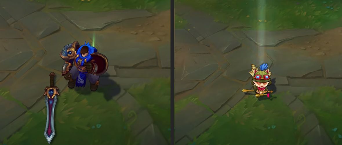
Silhouettes are the single most important thing for champion recognition in League. This is basically a champion’s shadow: What do they look like shrouded in darkness?
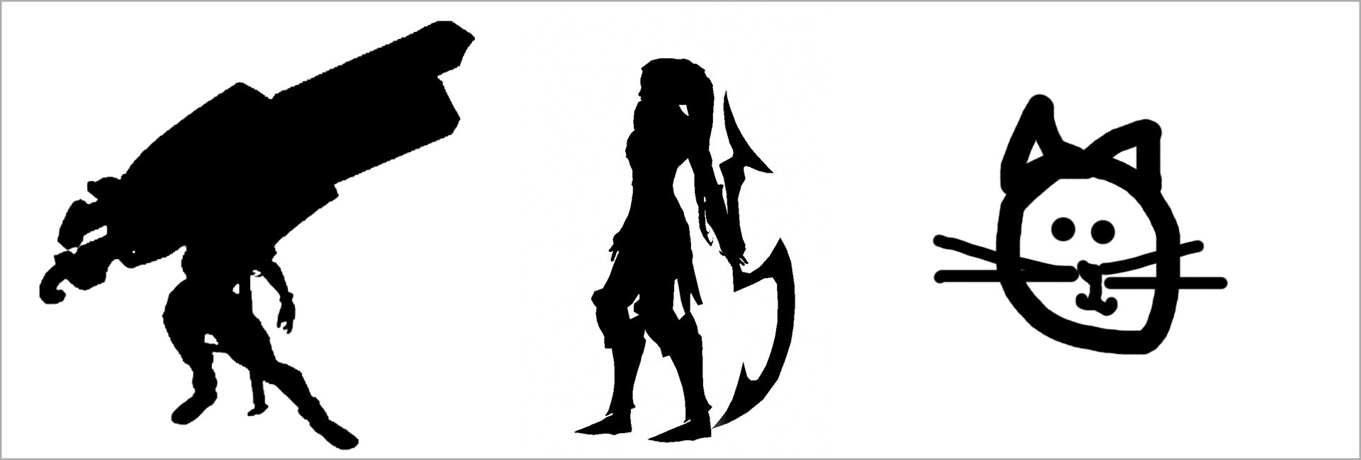
A good silhouette is one with a defining primary characteristic that’s unique to that champion: Think Senna’s gun, Diana’s moon weapon, or Yuumi… being a cat. Even when we make skins, a champion’s primary characteristic should never change.
Silhouettes also include animation, but ideally that’s more of a bonus differentiator rather than a main one. For example, Ivern’s lanky figure stands out on its own, but his goofy walk also adds to his recognizability.
Lee Sin, on the other hand, has a fairly generic shape, so a lot of his silhouette is carried by his animations. (Which is okay, although it can complicate skin design, which we’ll talk about later.)
Beyond easy recognition, a champion’s silhouette should highlight their source of power. This is especially important for new players who have to learn what 150+ champions do. If you see someone with a bow, you can assume they’ll fire arrows from a distance. A champion with a staff probably casts spells. And one with shotgun knees… shoots… you?
The size of a champion’s silhouette can also say something about their playstyle. For example, larger champions with bulky armor are probably tanks or fighters. A tiny innocent yordle probably isn’t.
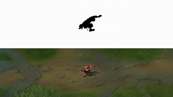
Last but not least, it should be clear which direction a champion is facing from their silhouette alone. You should know whether someone is charging towards you or away at a glance.
Abilities
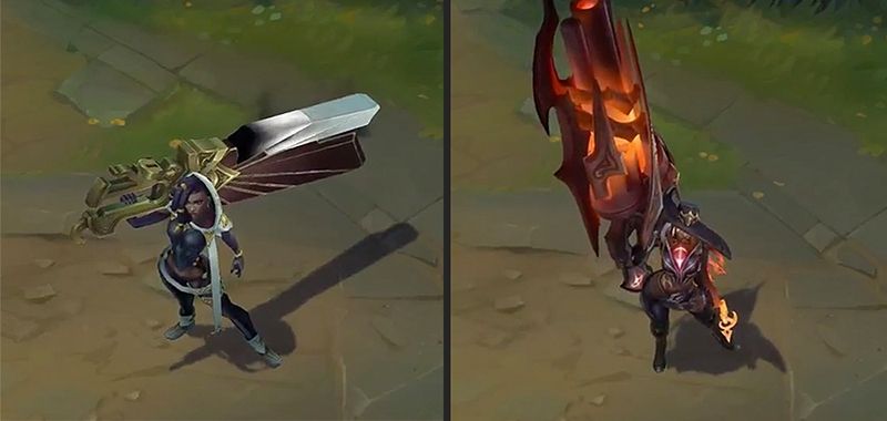
The second major consideration for champion clarity is their abilities. This is an area that can quickly become frustrating, particularly when hitboxes don’t line up with their effects. Over the past few years, we’ve been working to update the VFX for some of League’s older champions who aren’t hitting the bar, and we have more VFX updates planned for 2021, starting with Hecarim.
Hecarim’s VFX Update
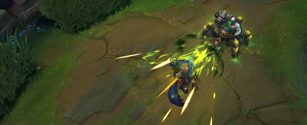
Beyond hitboxes, one of the most important things for abilities is that they follow hierarchy rules. In other words, the amount of attention an ability grabs should match its level of importance.
How important a spell is depends on a lot of things, including…
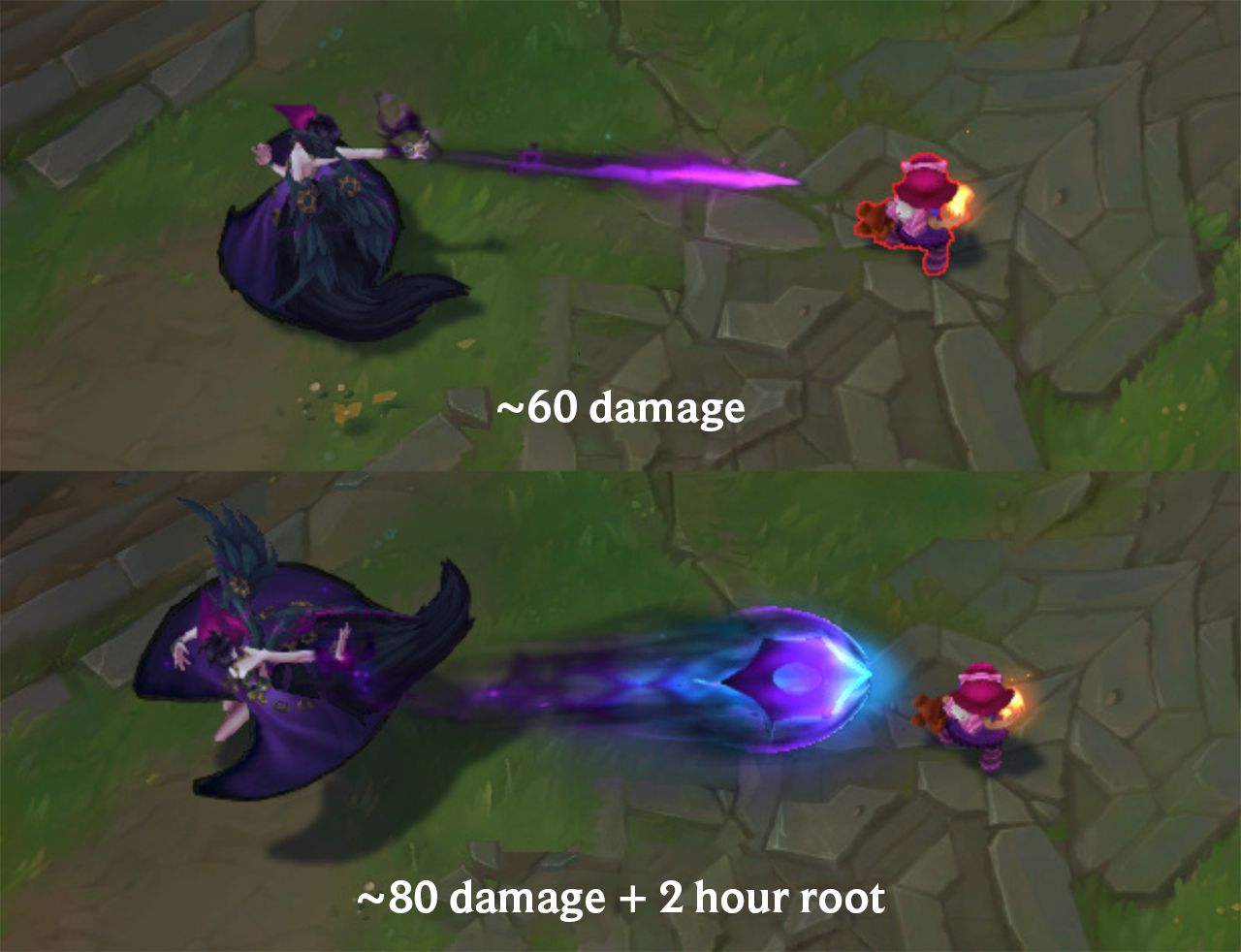
- How much damage does it do? Spells that do more damage should draw more attention. Zoe’s Q is an example of this done well—it’s bright, saturated, and has an audio cue ahead of time.
- Does it CC? Spells with hard CC and/or high-duration CC should stand out. Taric’s stun is a good example—it’s bright, there’s an audio wind-up, and a well-defined hitbox.
- Is it dodgeable? If something is dodgeable, it should draw more attention. While not a champion ability, Arcane Comet is an example of this done poorly—the big circle on the ground implies a lot more dodgeability than what’s realistic.
- Does it have a large impact on play? Spells that drastically change how you play with or against them should be flashy. The audio and visuals and on Kayle’s ultimate are a good example—it’s bold, but the impact is high.
Beyond upholding hierarchy, there are specific gameplay considerations to a spell’s audio and visual design. Feel free to click through if you’re curious!
Ability Considerations
Direction
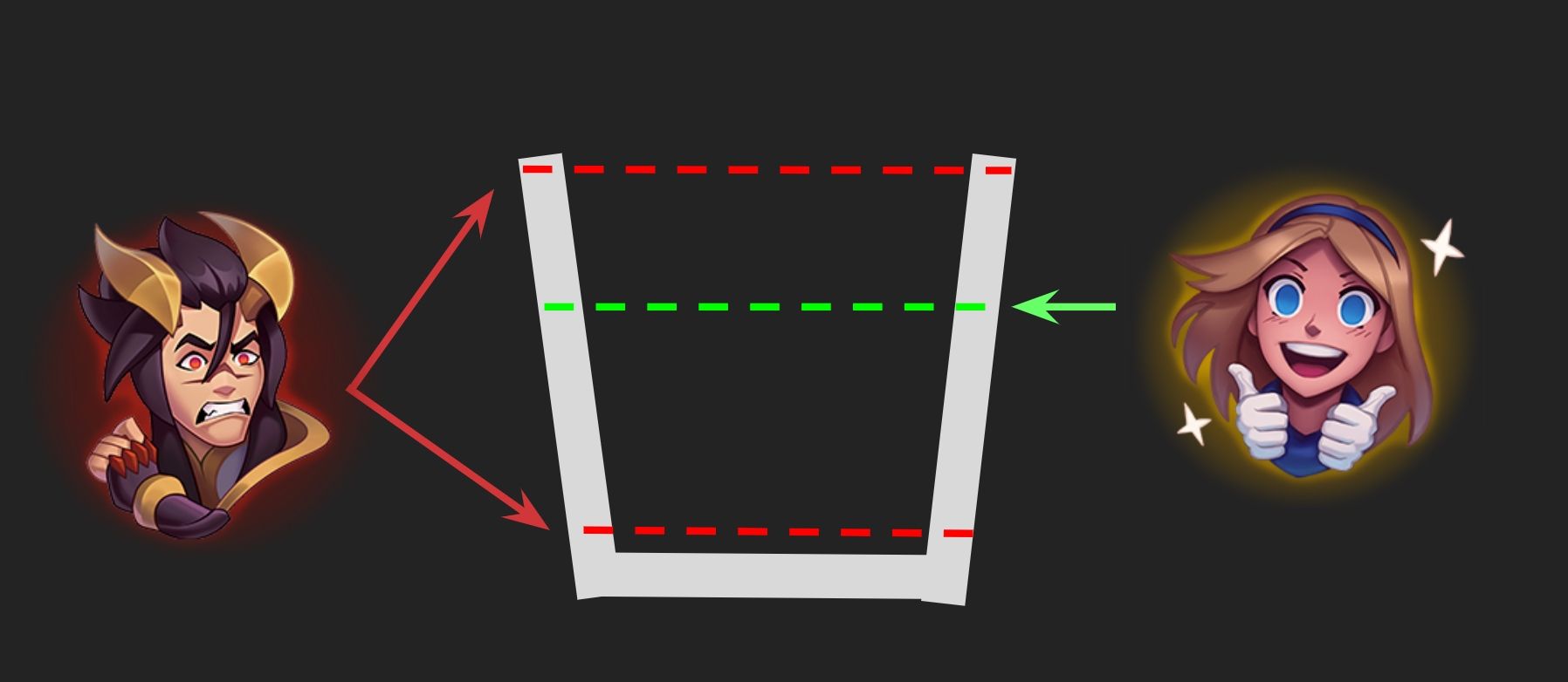
Projectiles should convey the direction they’re traveling, even without motion. This can often be accomplished by “blurring” the tail end of the effect.
Filling Up Buckets
The main clarity challenge with skins is creating something that feels meaningfully different from the base champion while ensuring they’re still recognizable. If we go too hard, then we sacrifice game clarity. But if we don’t go hard enough, it’s not going to feel satisfying.
In a way, skin development is like filling a bucket, where each discipline—like animation, VFX, SFX, and so on—can dump some water in. Our goal is to get that bucket nice and full without overflowing it.
How much water each discipline adds varies from skin to skin. Sometimes we focus on VFX and SFX, so we keep the model and animations closer to base. Other times we go for a full animation refresh, so we split the difference elsewhere. In the end, the complete experience should make it quick and easy to identify the champion at all times. This means we’ll never turn everything up to 11, as we’d end up with something exciting that’s seriously damaging to clarity.
You Care About What!?
Now that we’ve addressed the timeless struggle between coolness and clearness, let’s run through some specifics.
Silhouettes
A champion’s silhouette can be broken into three parts: primary, secondary, and tertiary. A champion’s primary feature should never be removed or significantly altered in any skin. We’d never give Senna a pea-shooter or turn Yuumi into a human, for example.
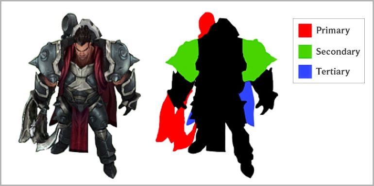
There’s a little more leeway with secondary and tertiary features, especially if a champion has a strong primary read. High Noon Senna is a great example of this: Her body’s silhouette is noticeably different from her base, but because she still has her iconic gun, she’s immediately recognizable.
Champions whose silhouettes are carried through animation can be challenging to make Legendary (or Ultimate) skins for. This is because changing their animations has a greater impact on their silhouette, which adds more water to the bucket. If you add in some flashy VFX, SFX, and model changes, it’s easy to lose the champion’s identity. This is another reason why we want every new champion to have a strong primary feature.
Abilities
We use a champion’s base abilities as the clarity bar when designing skins. In other words... Every ability should be at least as clear as the base skin because skins should never be pay-to-win. Abilities on skins can be slightly clearer than on base, but we don’t really want anything to be pay-to-lose either, so our goal is clarity parity.
Established shape language should be used for skins as well, like scrolling-down lines for spell shields.
Abilities should also maintain hierarchy and not add excess noise to the game, which means we should be intentional with the extra bells and whistles. That said, we sometimes overshoot this. We want to make the best, most exciting skins possible, and it’s a delicate balance between that and gameplay noise and hierarchy.
In the end, our goal is to release skins that feel great with abilities that are clear even during the most chaotic teamfights. With that in mind, here’s a look at some specific changes we’ve made during development because of various clarity concerns. Peruse at your leisure!
Changes From Development
Shan Hai Scrolls Jhin
The borders of Shan Hai Scrolls Jhin’s Curtain Call originally faded out while the ult opened, making them very difficult to see during the opening sequence. We adjusted the lines so they’re always visible.
Maps
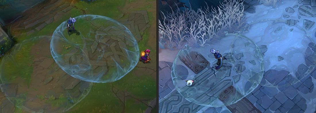
Now onto a few final considerations, starting with maps. Surprising no one, skins should be clear no matter which map you’re on. We haven’t always been the best at this, but these days we check every skin across all maps to make sure we don’t end up with any more Freljord Taliyahs on the Howling Abyss.
Transformations
It’s important that any significant or lasting transformations are only be used during homeguards or other empowered states. Spirit Blossom Ahri’s fox transformation is an example of this done well—you only see her full-fox form in homeguards and human-fox form while her ult is active.
On the other hand, near-permanent transformations like Solar and Lunar Eclipse Leona’s are something we’d like to avoid going forward. Unless you’re familiar with the skin, it’s unclear whether her glowing means she’s transformed or has Q active and is about to bop you.
Cosmetic Animations
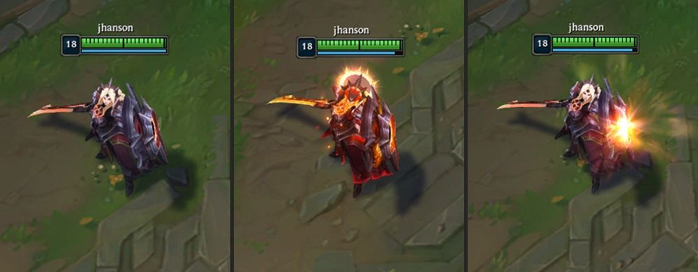
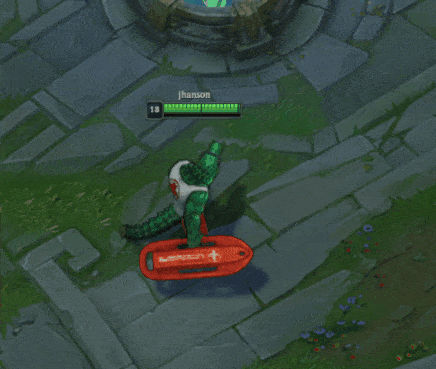
Last but not least, let’s talk about cosmetic animations, like recalls, dances, taunts, and so on. In short: None of these animations should provide a competitive advantage. This may seem obvious, but sometimes these animations get too flashy (especially when spammed) or have champions “abandoning” their hitboxes.
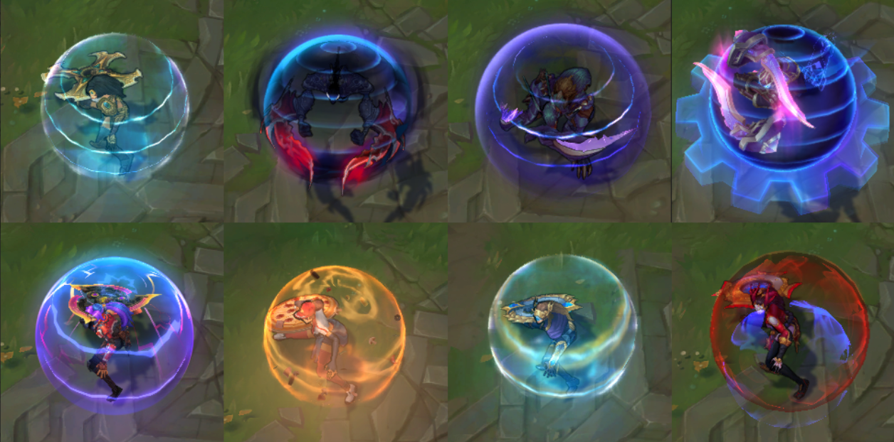
Pool Party Renekton is the poster crocodile for this. Spamming his recall sure looks fun, but it’s distracting and his hitbox never changes, even as his model appears to move upward. Going forward, we have a strict rule where champions must stay in their recall circle for at least two seconds, but really, we’d like it if they stayed there all the time.
The End
That’s all we have for today! We hope our extra efforts around clarity become more noticeable with time. If there are any skins or champs you’re curious how we approached clarity for, feel free to send ‘em our way using this form.
Thanks for reading. You’re all lovely. Goodbye!